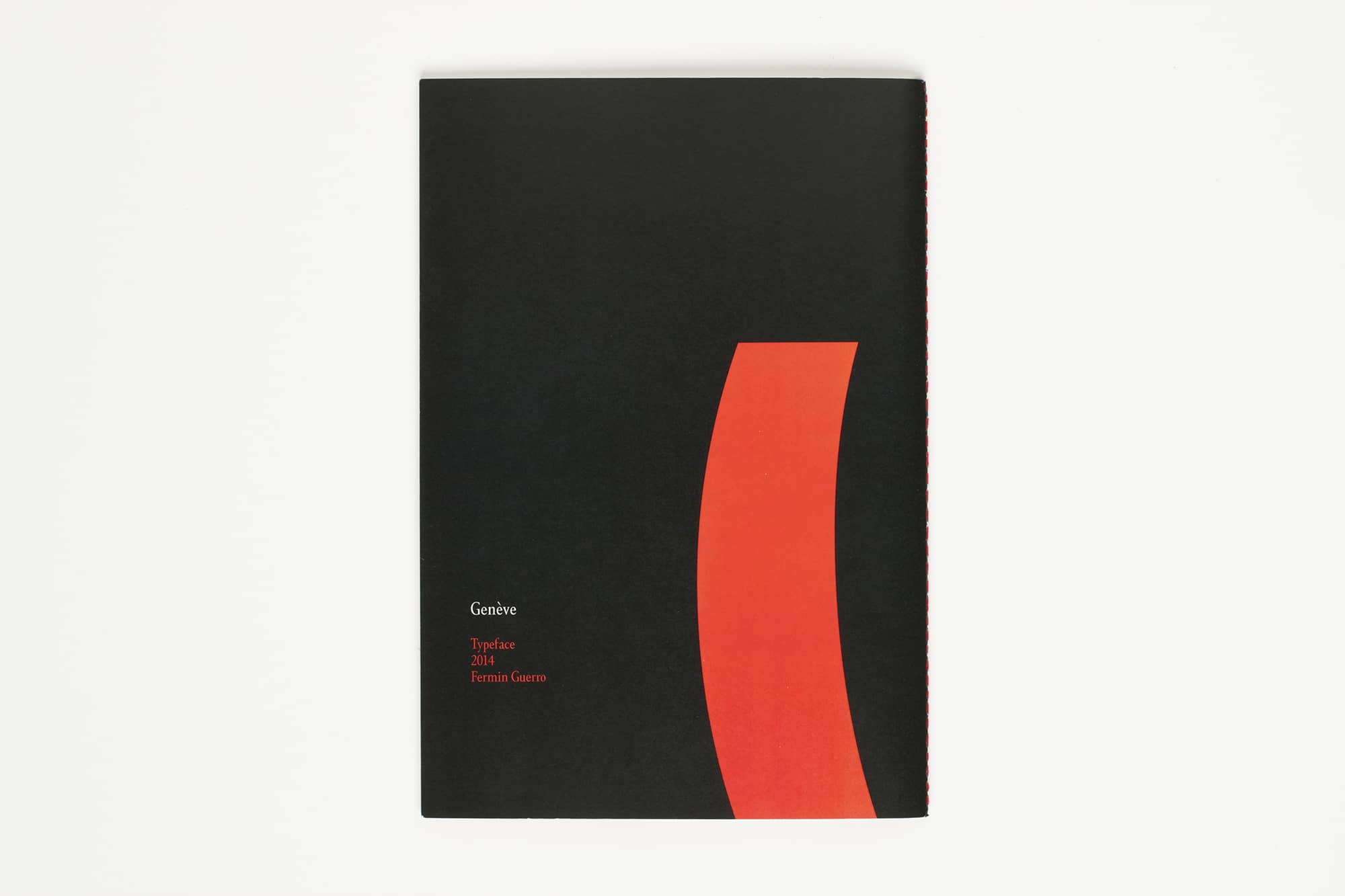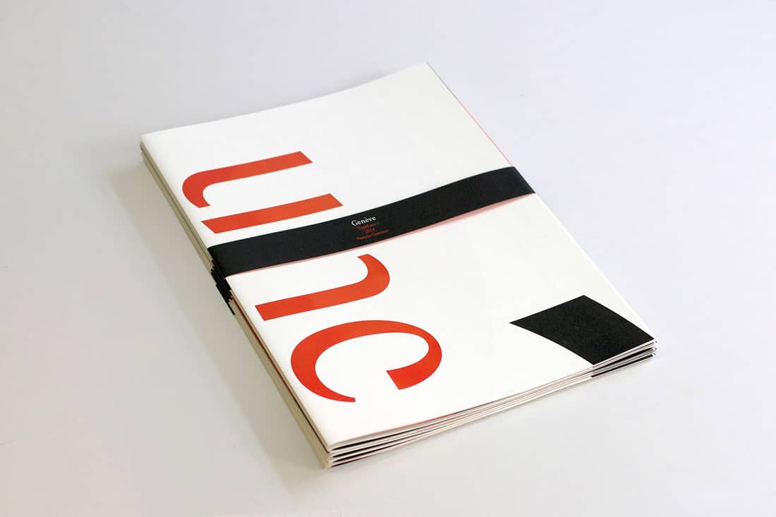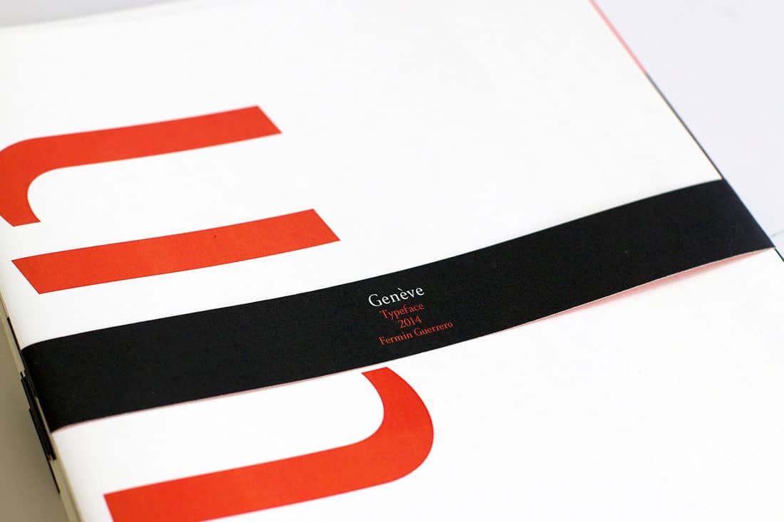
Genève Typeface
2014
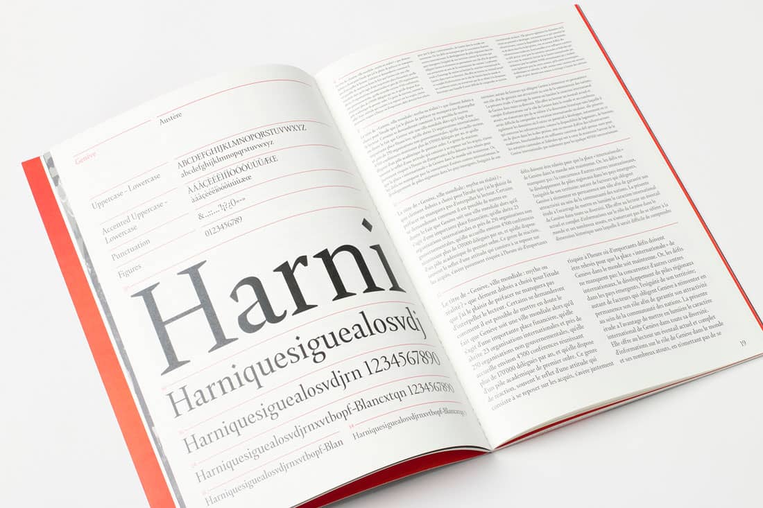
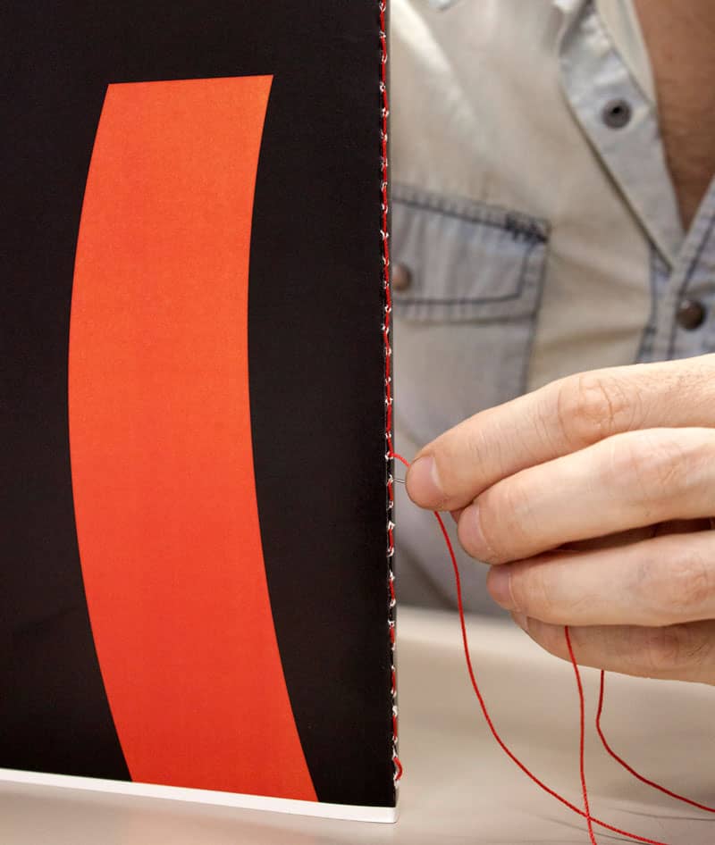
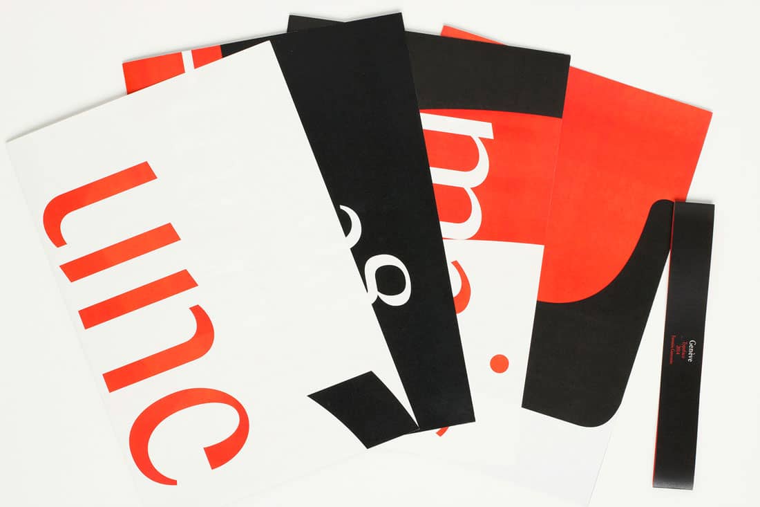
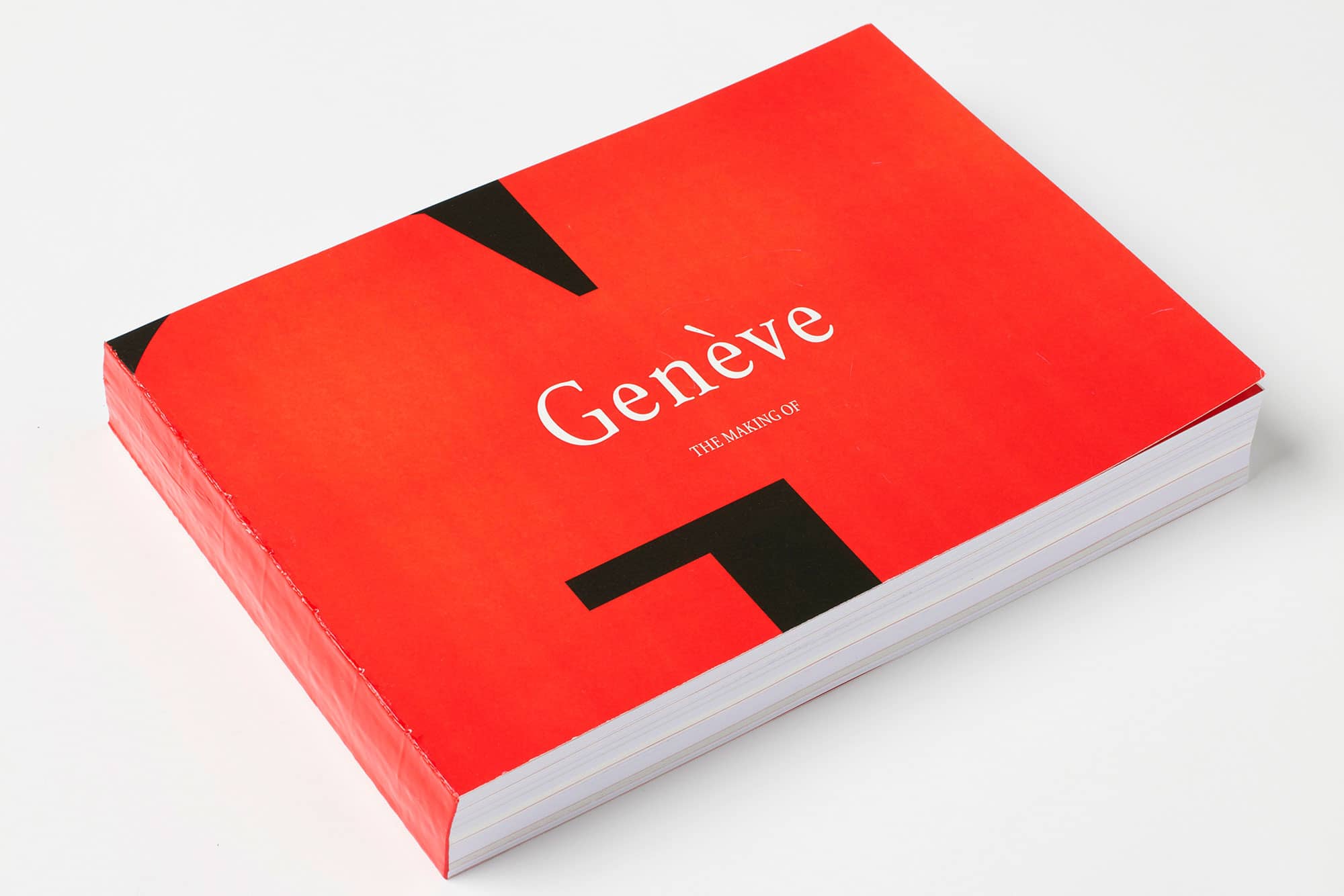
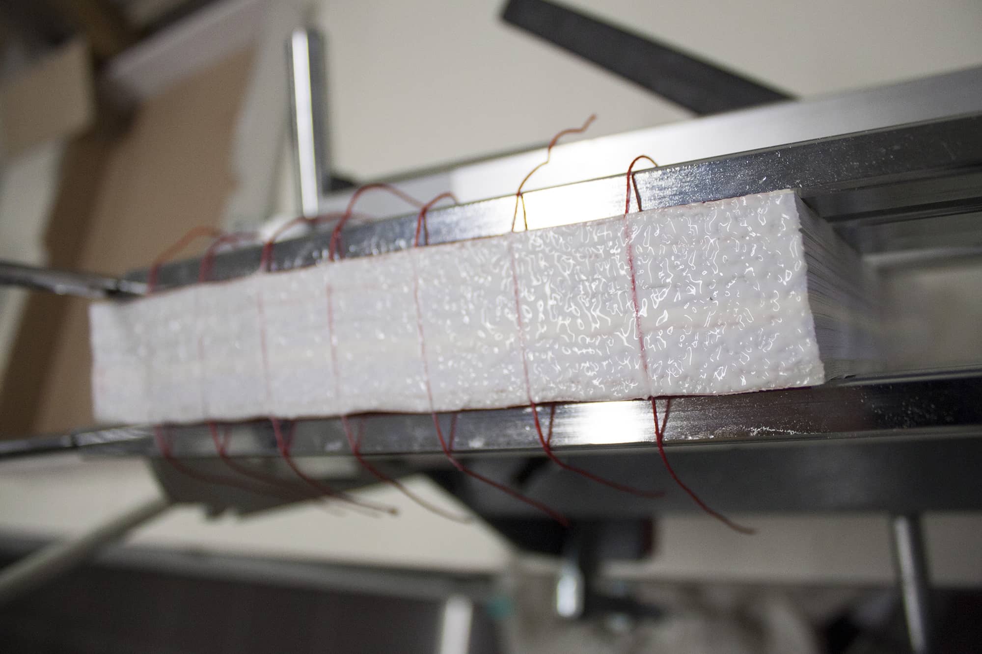
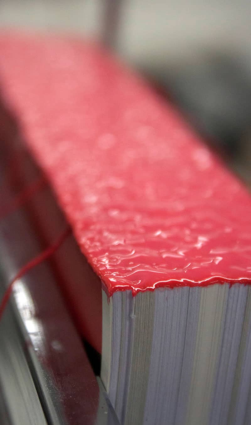
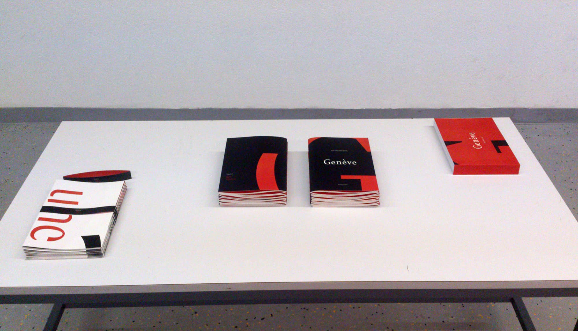
Binding and photos of Genève: The making of : Aniello Frasca.
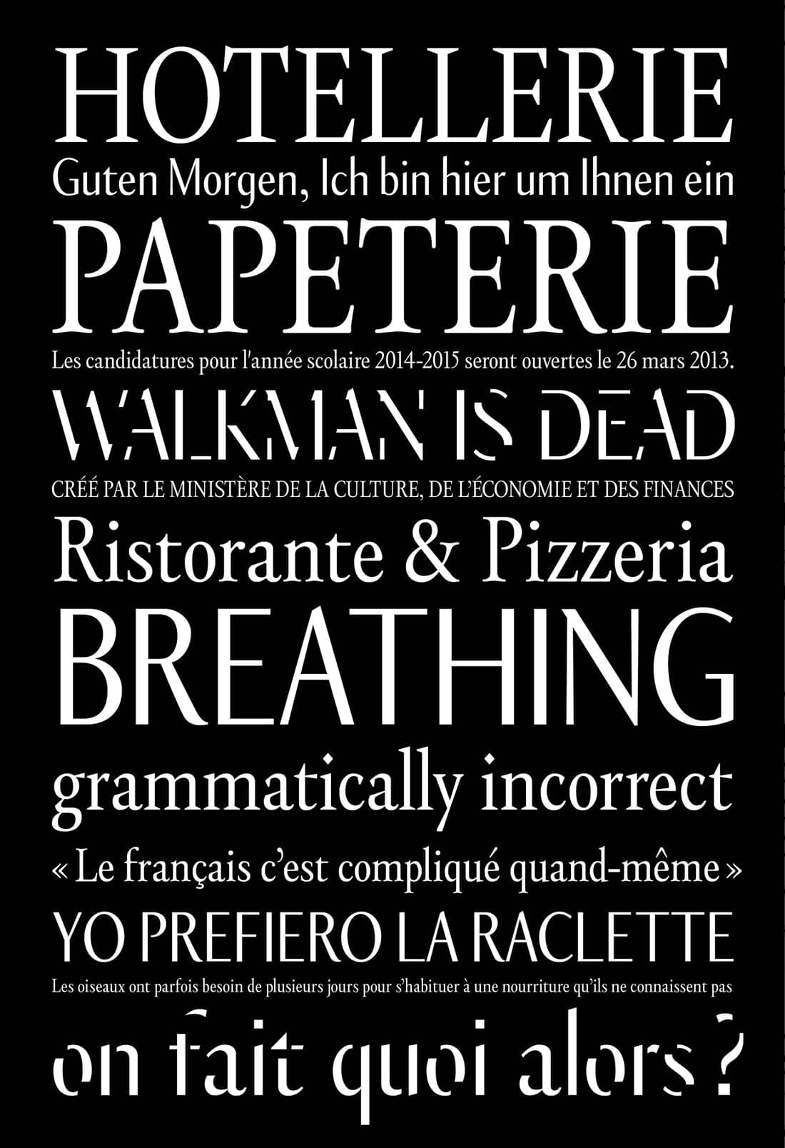
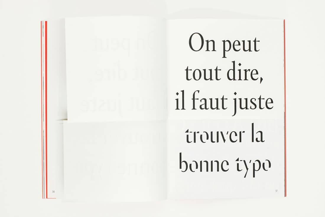
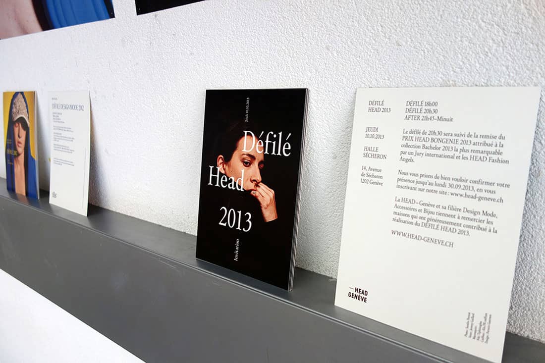
Genève is a type family inspired by the rich typographic history of Geneva and was conceived as part of my Bachelor thesis at HEAD University, Geneva.
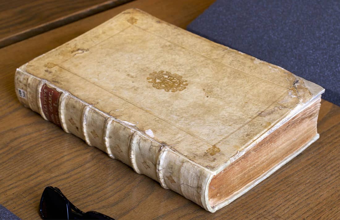
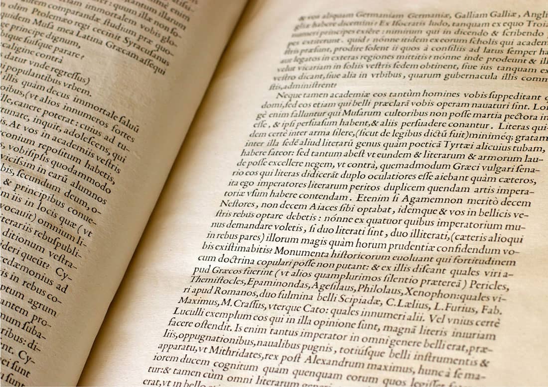
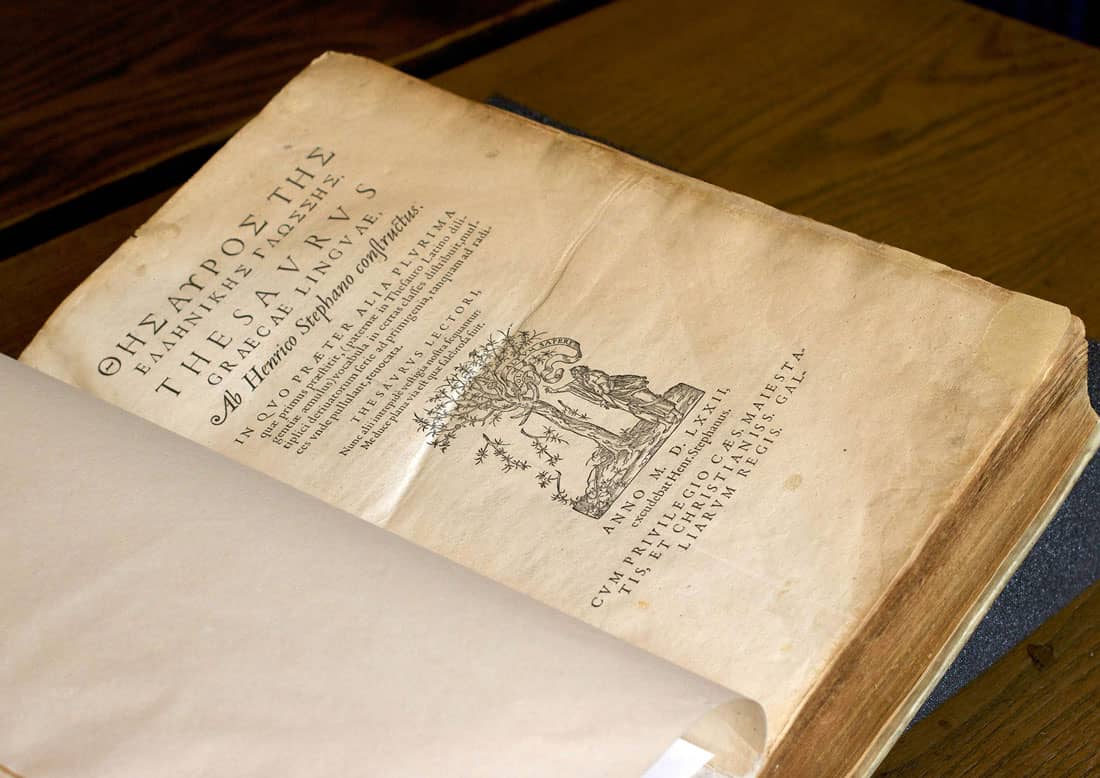
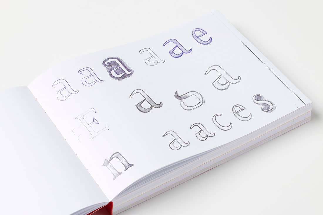
In developing Genève I was inspired by the typeface used by French printer/editor/publisher Henri II Estienne in his famous book Thesaurus Linguæ Græcæ, published in Geneva in 1572. This typeface was brought to Geneva by Henri’s father, Robert Estienne, who, before settling in Geneva and working as Calvin’s printer, was the printer of France’s King, François I. This typeface highly influenced the typographers and printers in Geneva at that time. Henri and Robert Estienne’s work in Geneva helped it to become one of the most important cities in Europe for print and typography in the sixteenth century.
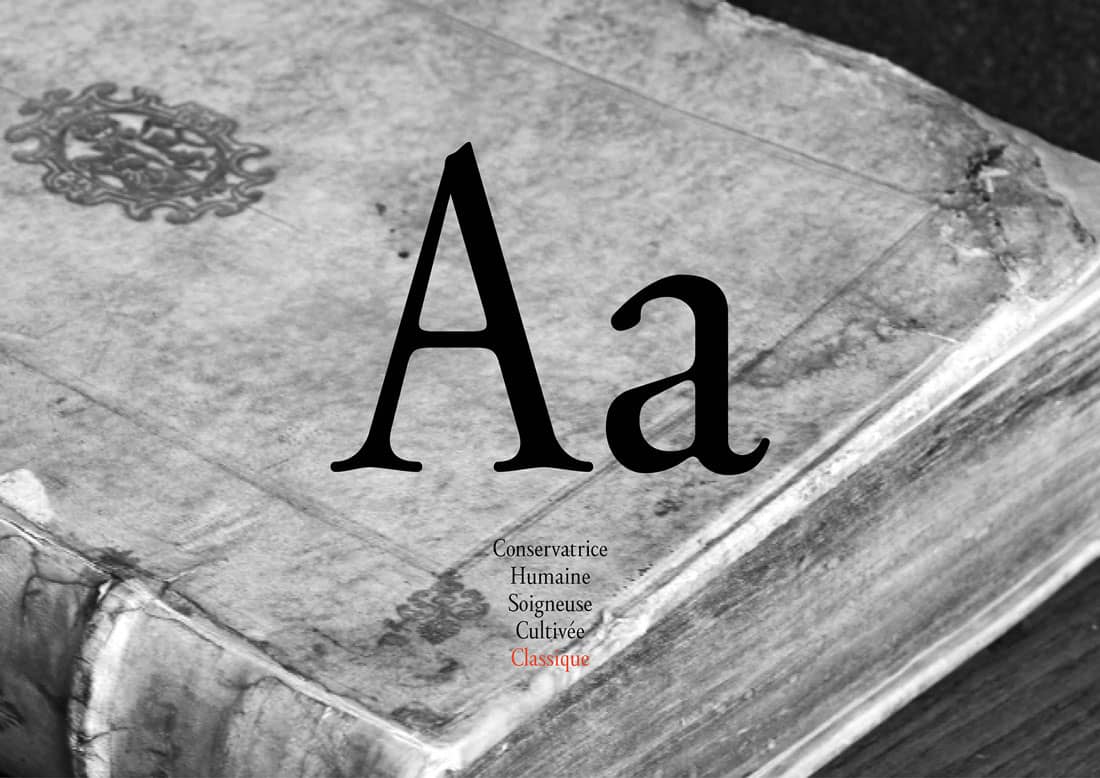
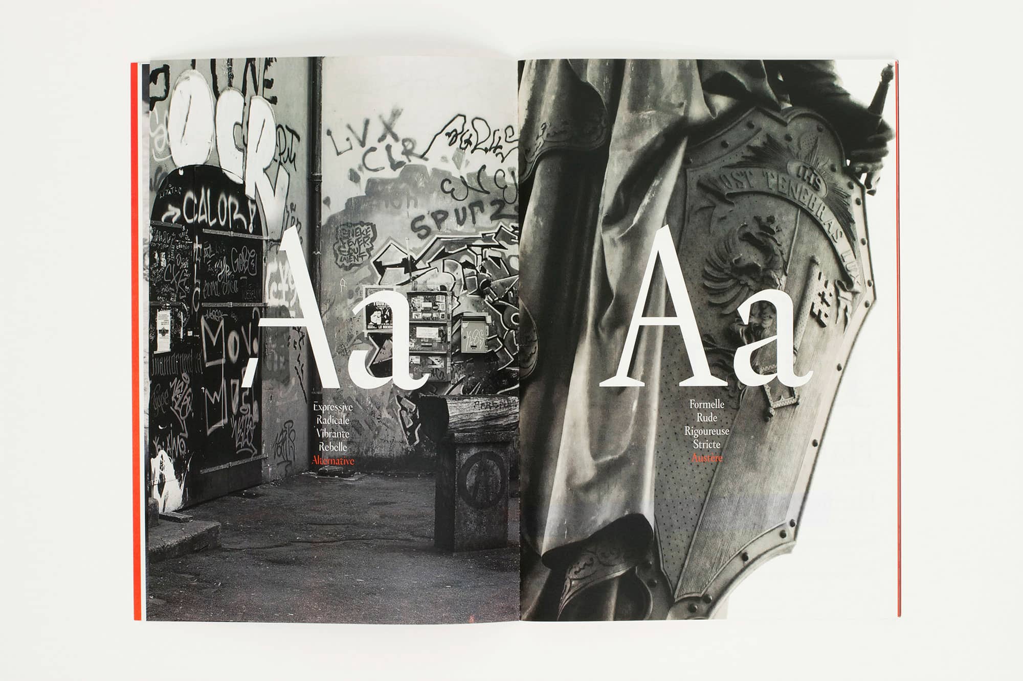
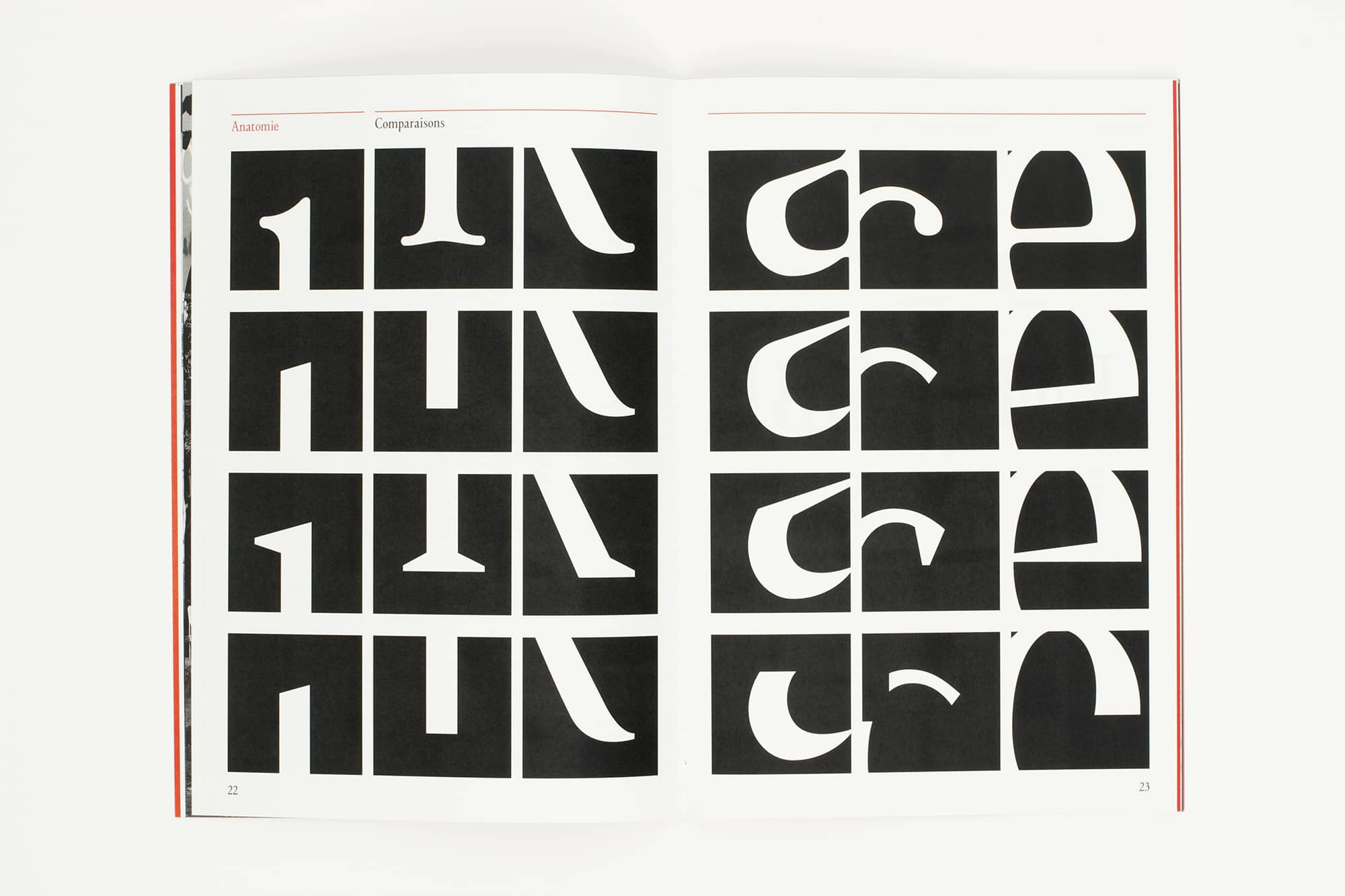
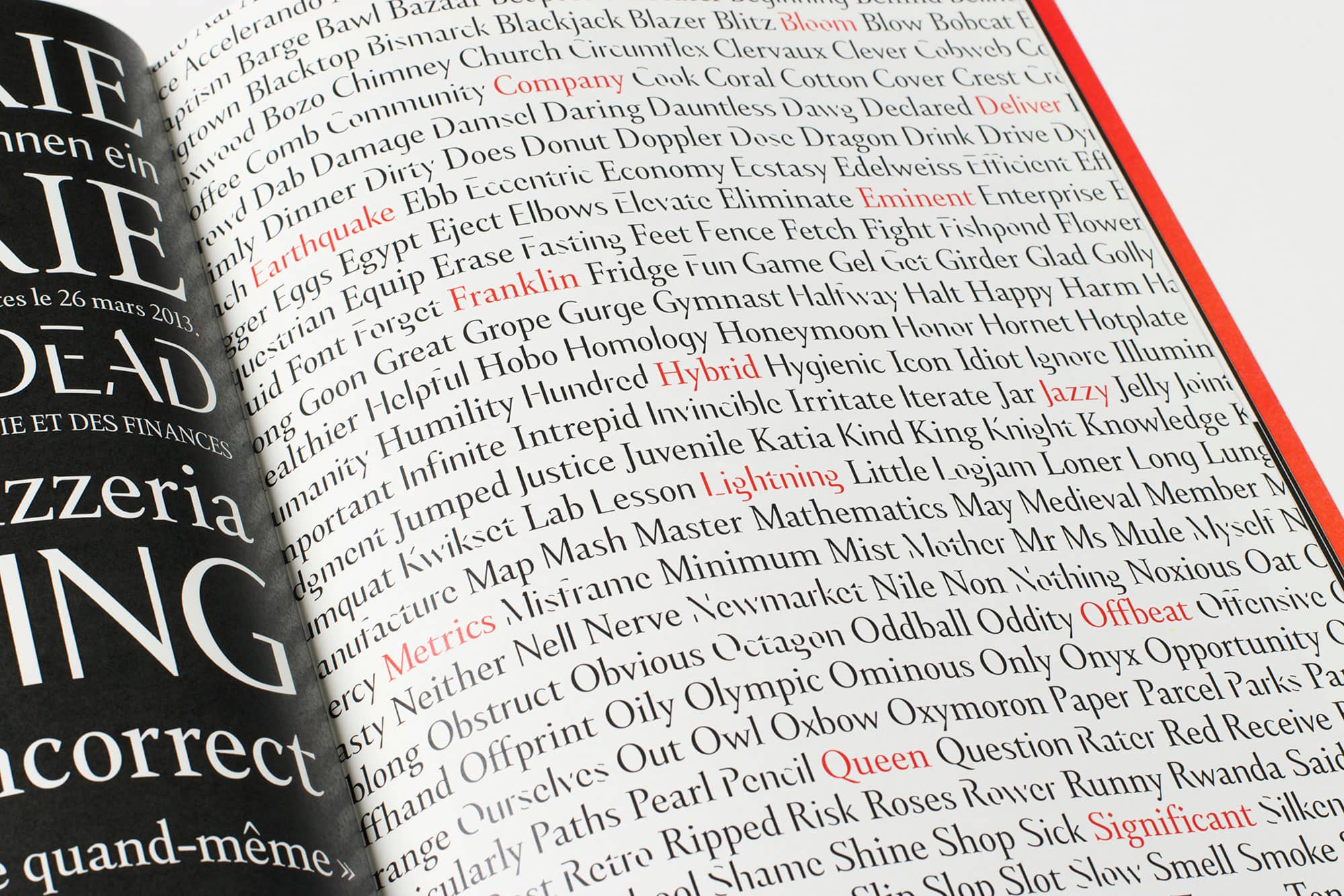
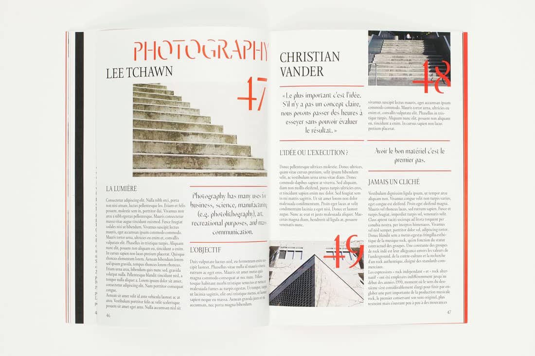
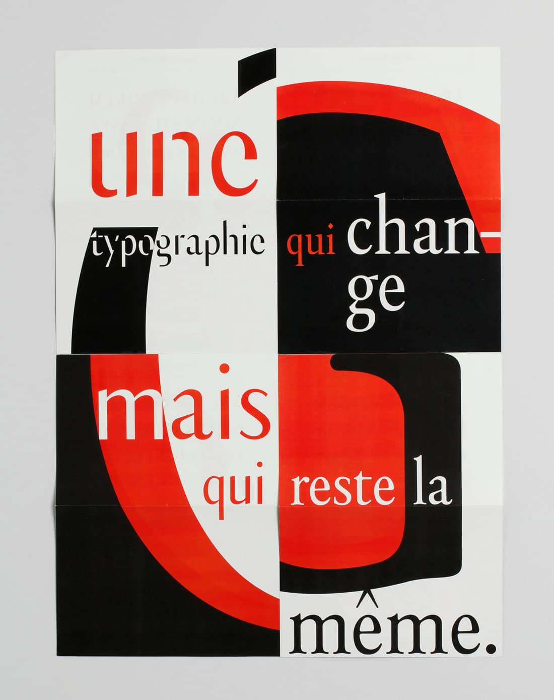
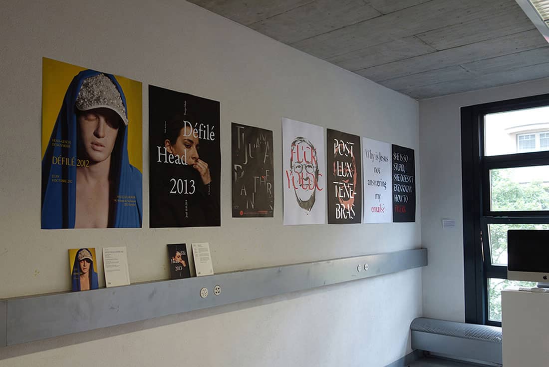
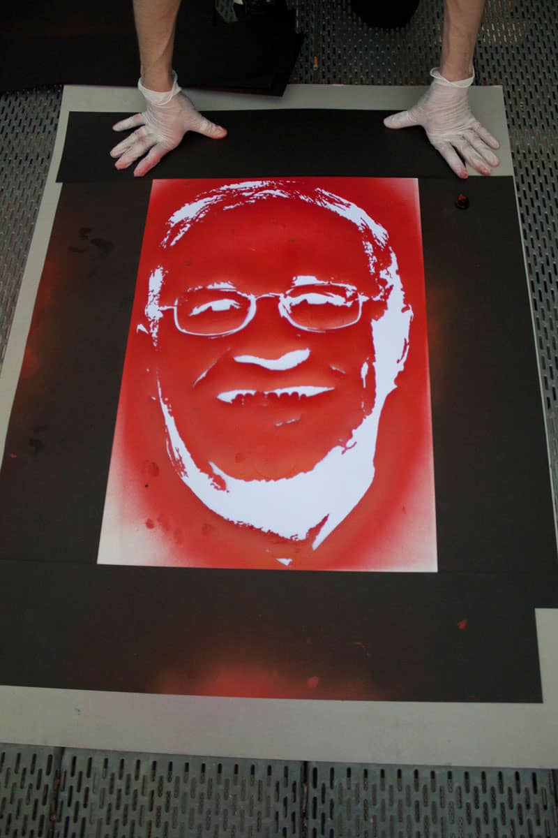
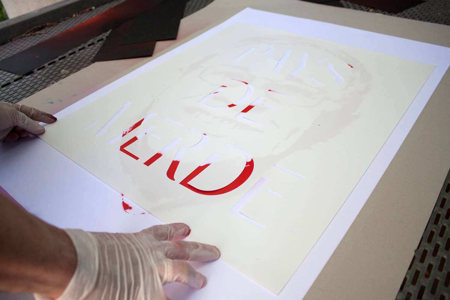
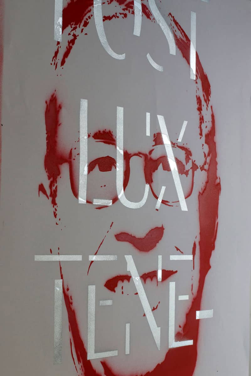
Designed to be used on any type of printed support, Genève is a typography with personality and flexibility, which allows designers to express their ideas in different ways without losing coherence. Genève consists of four styles: Classique (Humanist serif), Austère (Geometric serif), Spontanée (Humanist sans-serif) and Alternative (Stencil, display version). These styles correspond to the different profiles of the city, reflecting its multiculturalism and diversity.
I received the BEA Fondation Award for Young Artists for my work on the Genève Typeface. Some years later Genève typeface was further developed and became Thesaurus.
