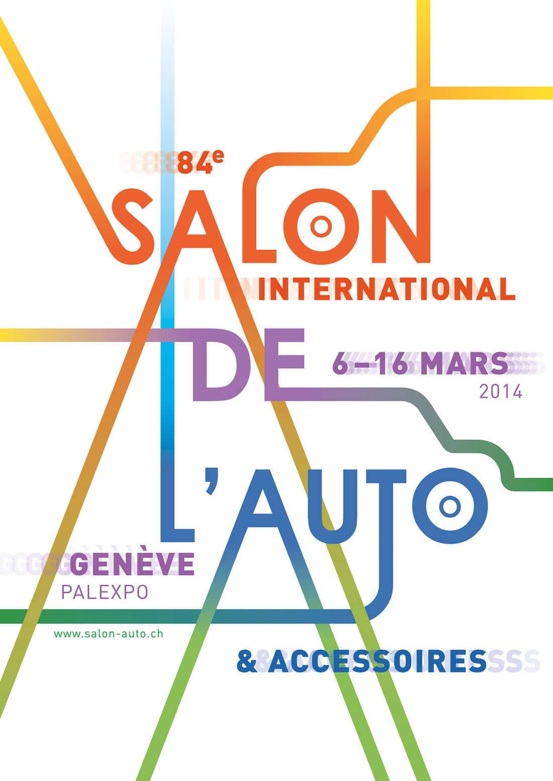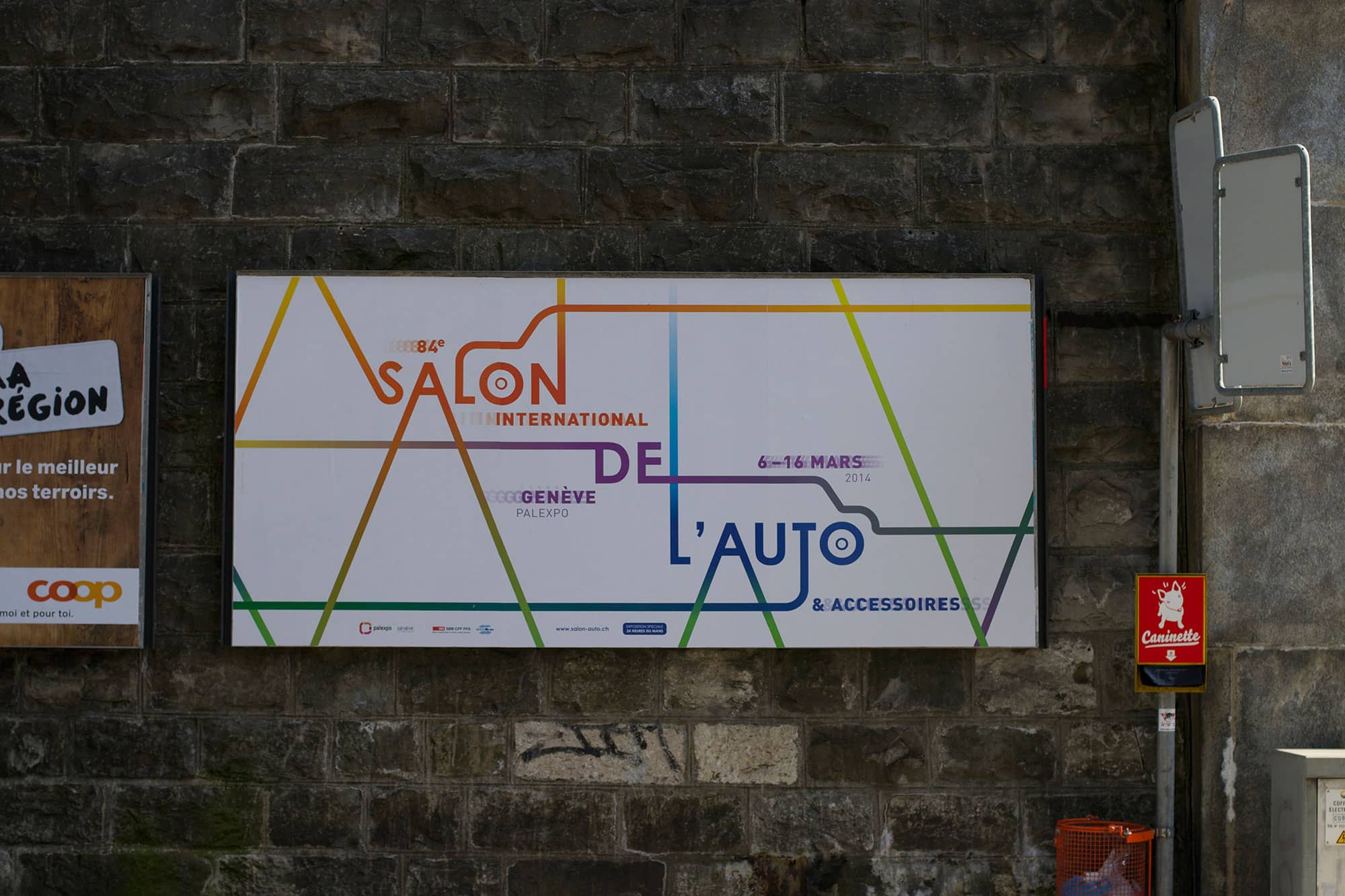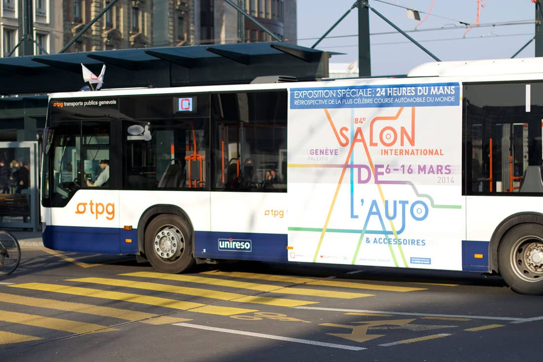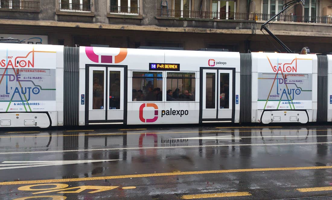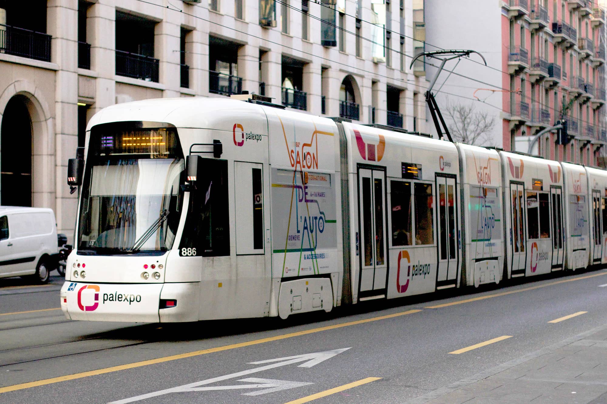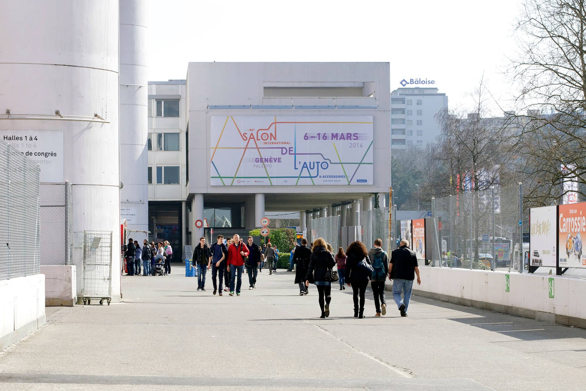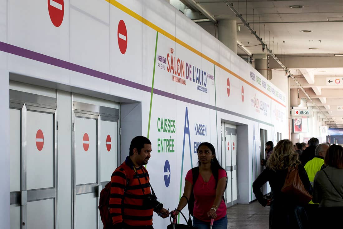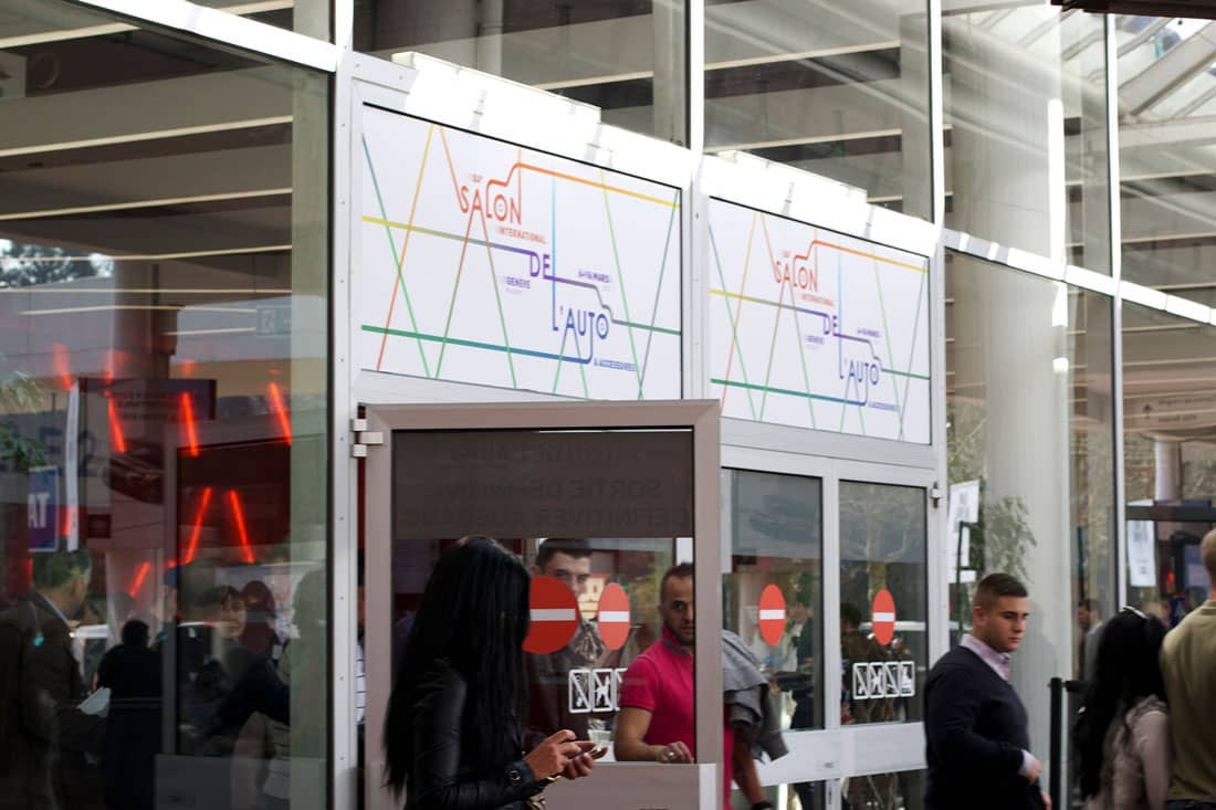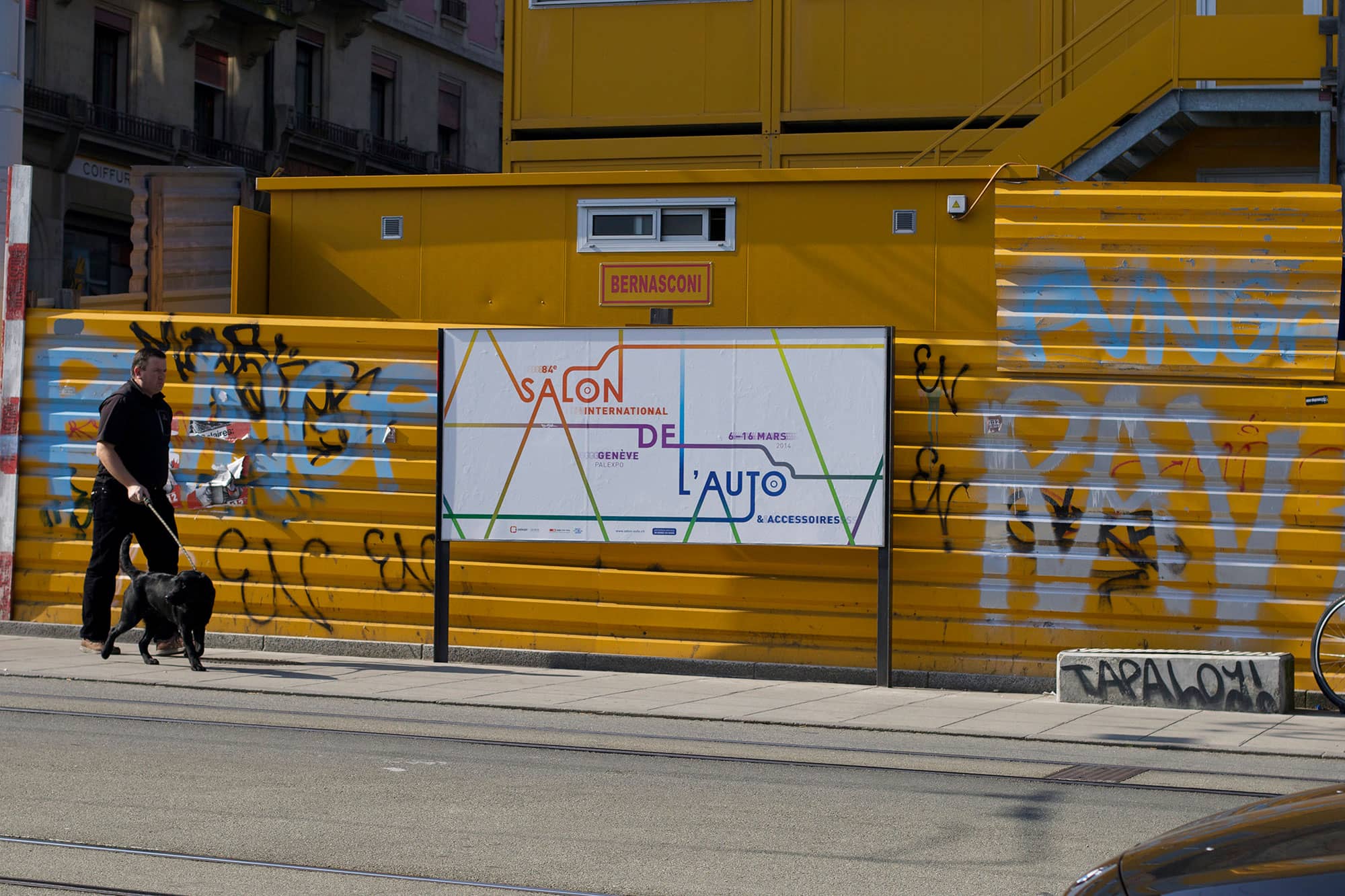
Geneva Motor Show
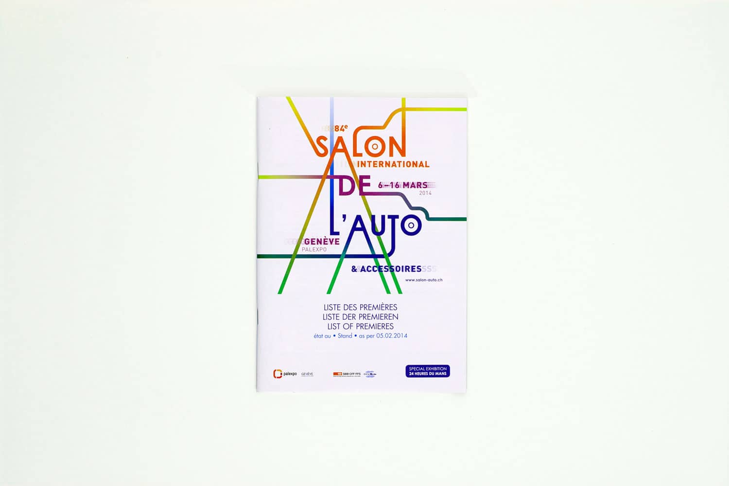
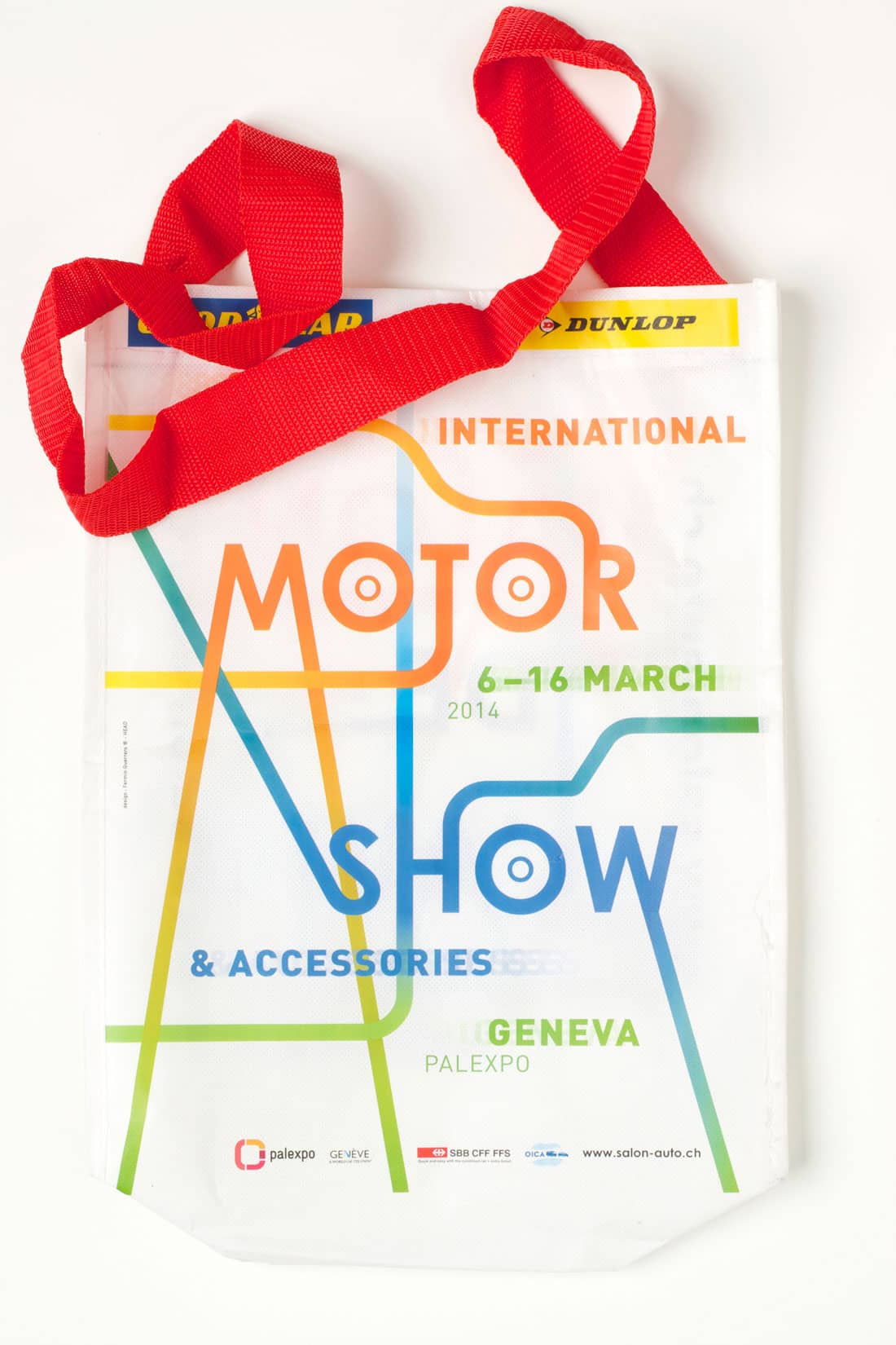
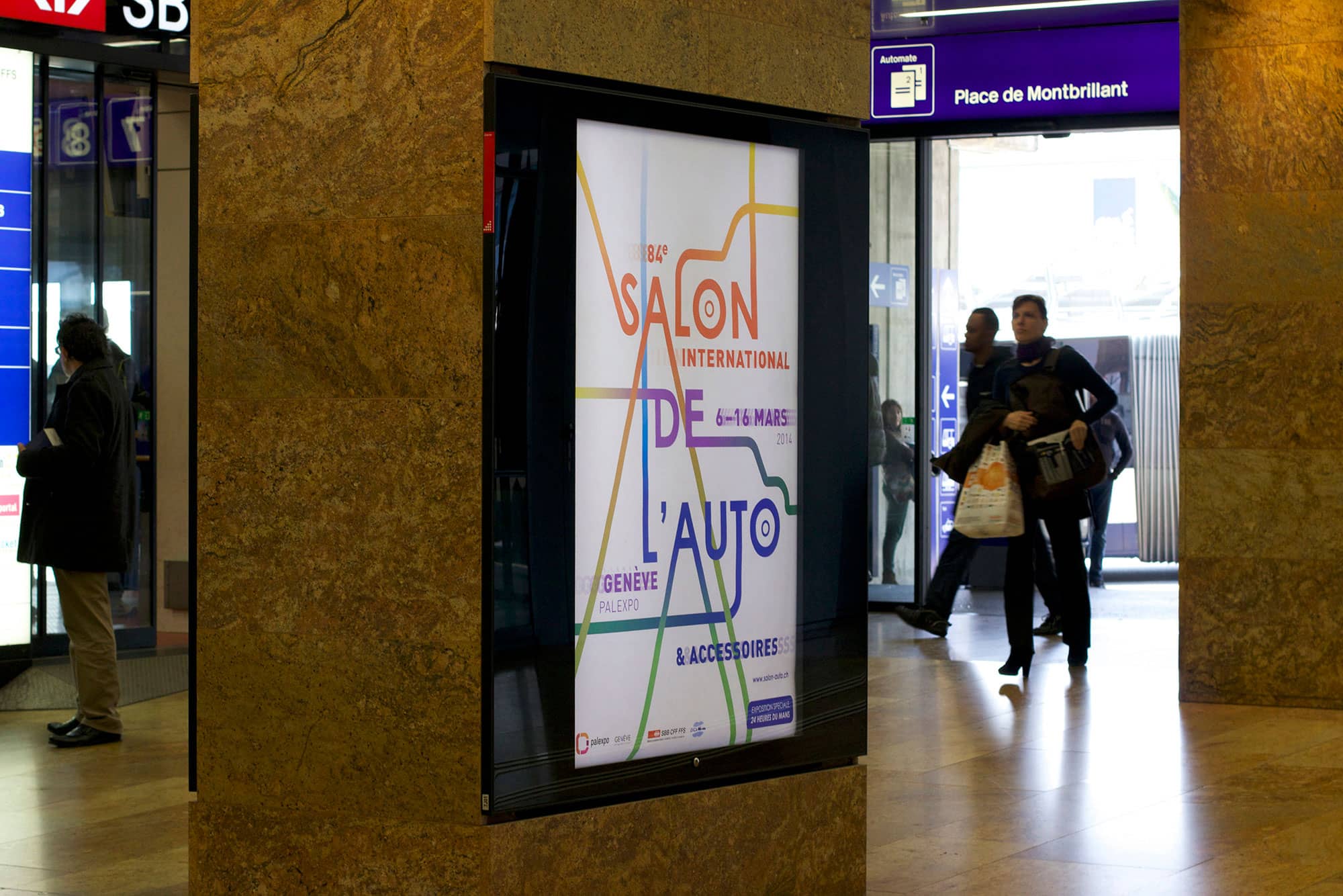
Poster design and visual identity for the Geneva International Motor Show. These visuals were used across all the national and international communication campaigns for the Geneva Motor Show.
I wanted to propose a design concept that really deferred from the “regular” style of the Geneva Motor Show which typically consisted of busy images including figurative automobile representations. Furthermore, I also noticed that text and image were treated as two completely distinct elements lacking integration. The text ended up taking the shape of a rigid block that was placed the same way across all supports. My goal was then to create a minimal and abstract design that evokes feelings and emotions related to the automobile sector rather than focusing on the actual car itself. Additionally, I wanted to make the text the protagonist element of my design. Thus, I proposed a design with different reading levels, where the lines suggest a network of roads which evoke the number of visitors coming to visit the Motor Show every year from around all over the world. They also suggest the shape of the most iconic landmarks composing the traditional Geneva’s landscape: Cars, mountains, the Jet D'eau, and so on. As for the colours, I was inspired by the season in which the Geneva Motor Show takes place, spring. The creation and composition of the poster is entirely drawn out typographically.